Wireframes
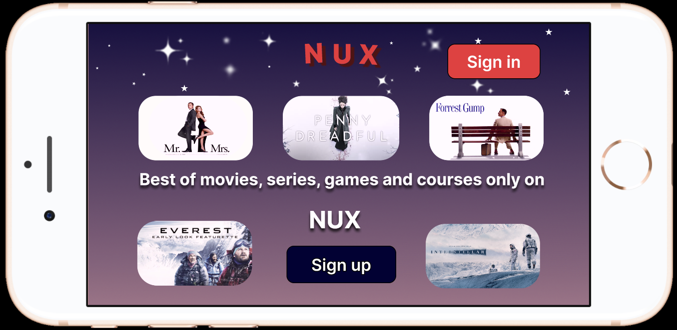
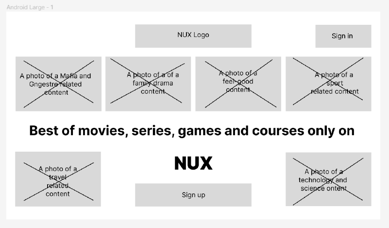
Landing page
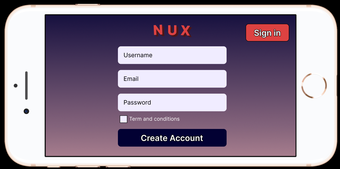
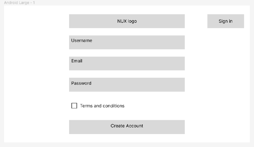
Sign-Up Page
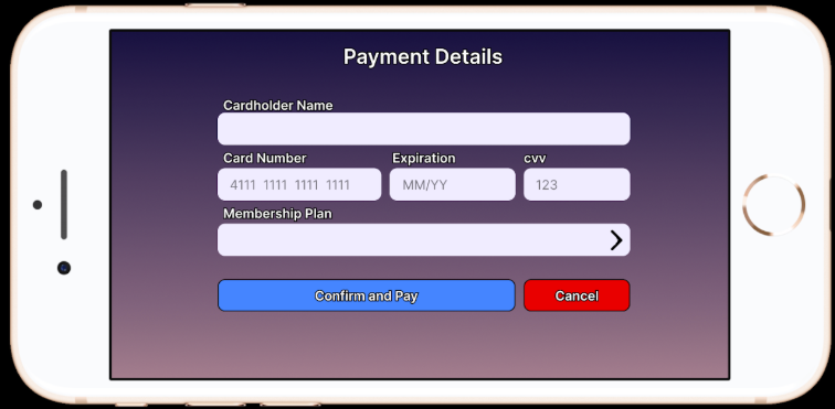
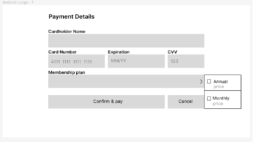
Checkout Page
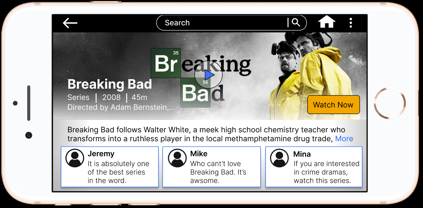
Catalogue Page
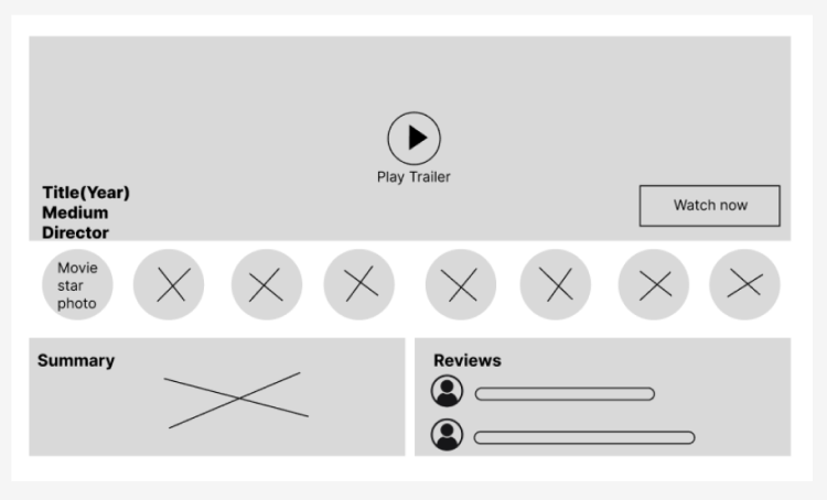
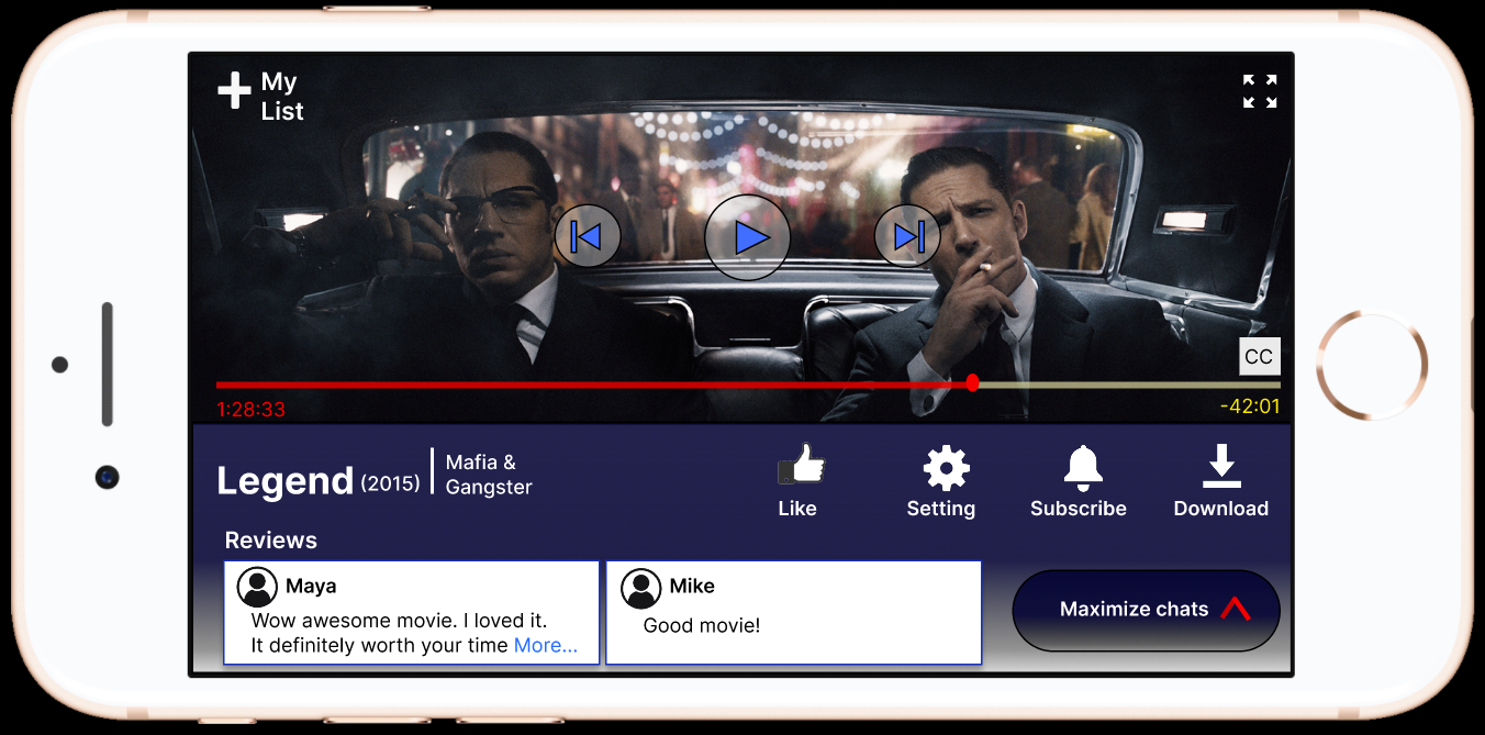
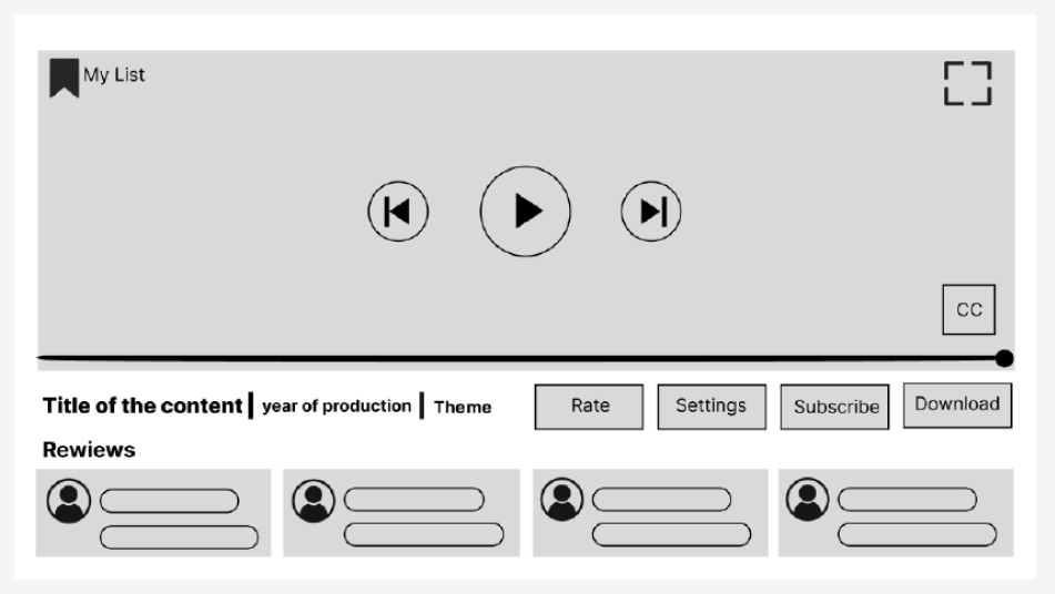
Viewing Page
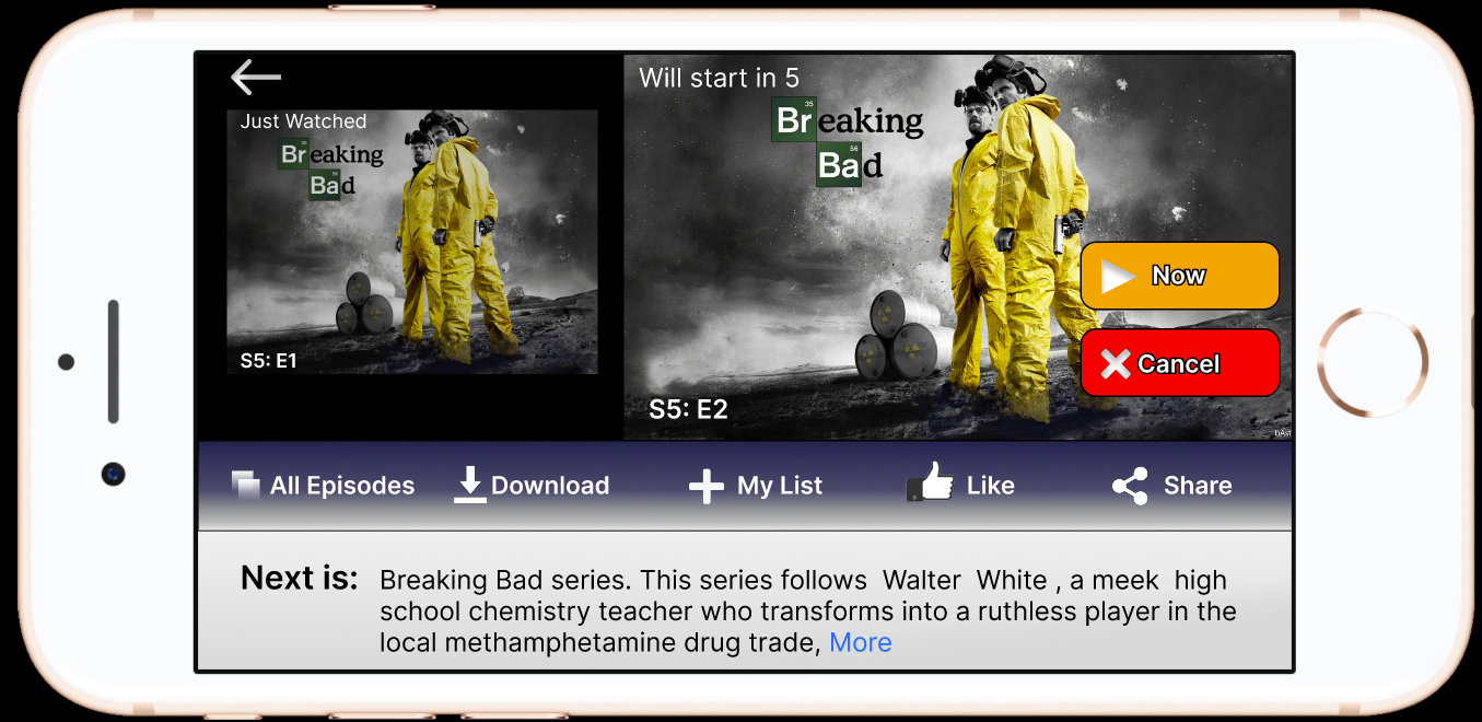
Post-Watch Screen
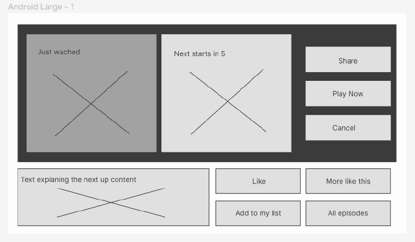
I began the project by reviewing existing streaming platforms to understand common patterns and best practices. By benchmarking well-known apps such as Netflix and YouTube, I was able to observe how content is organized, how playback controls are positioned, and how users interact with key actions in landscape mode. This step helped ground my design decisions in familiar conventions and reduced the risk of introducing unnecessary complexity.
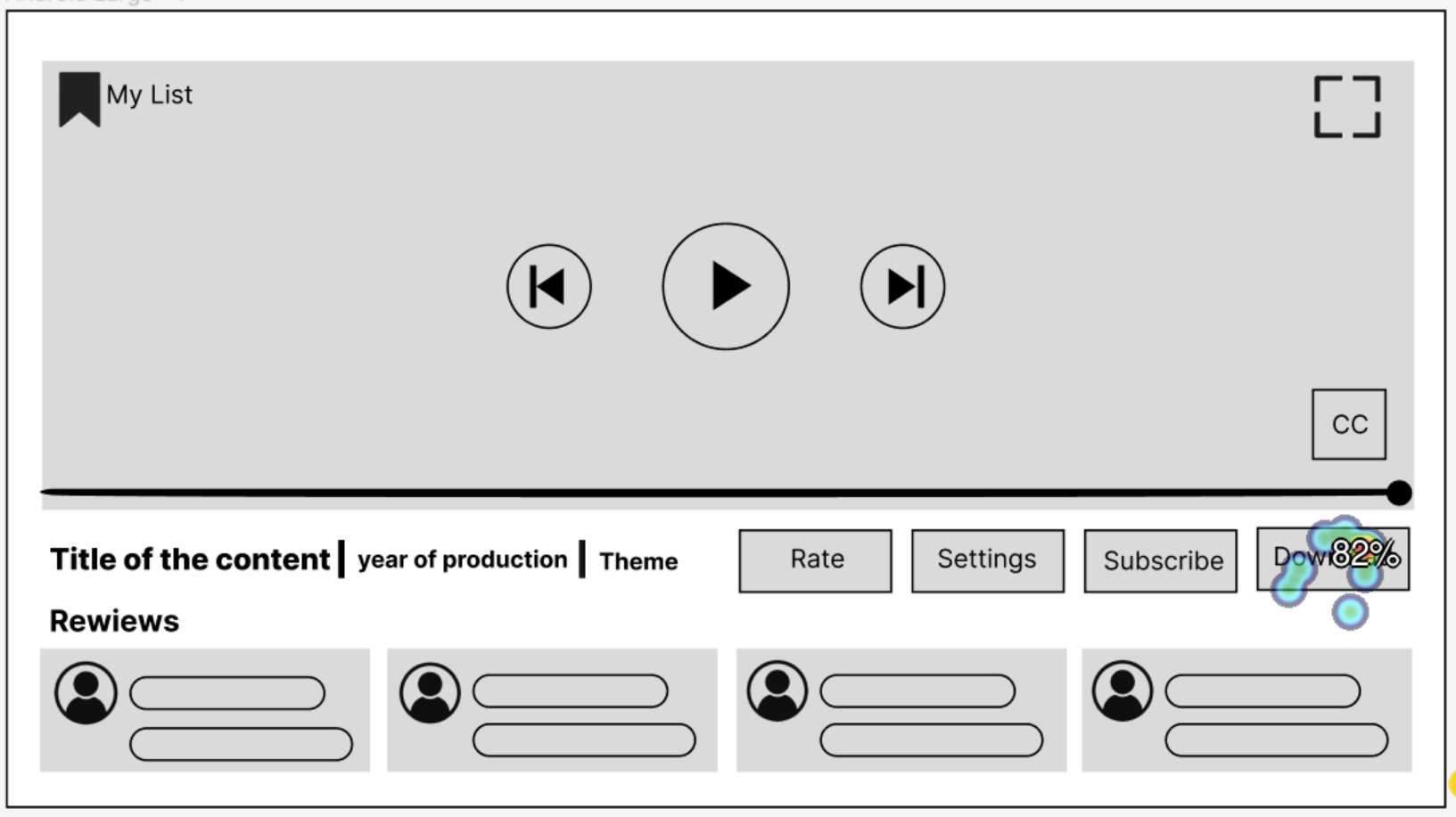
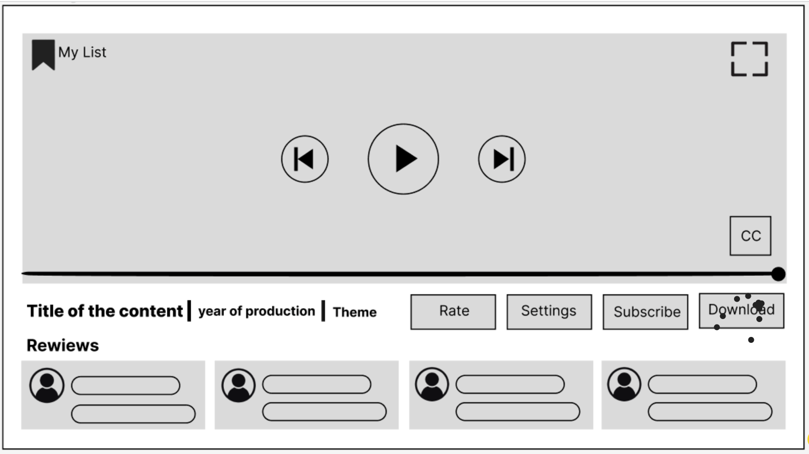
Based on the insights from benchmarking, I created low-fidelity wireframes to define layout, hierarchy, and navigation across the three required screens. At this stage, the focus was on structure rather than visuals, ensuring that content, controls, and actions were placed logically for landscape use.
Based on the insights from benchmarking, I created low-fidelity wireframes to define layout, hierarchy, and navigation across the three required screens. At this stage, the focus was on structure rather than visuals, ensuring that content, controls, and actions were placed logically for landscape use.