Redesigning
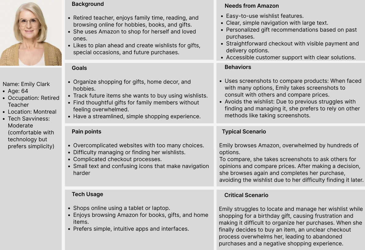
My redesigned Amazon homepage prioritizes clarity, simplicity, and accessibility, addressing Emily’s specific needs while maintaining a familiar shopping experience.
Key Improvements in My Design:
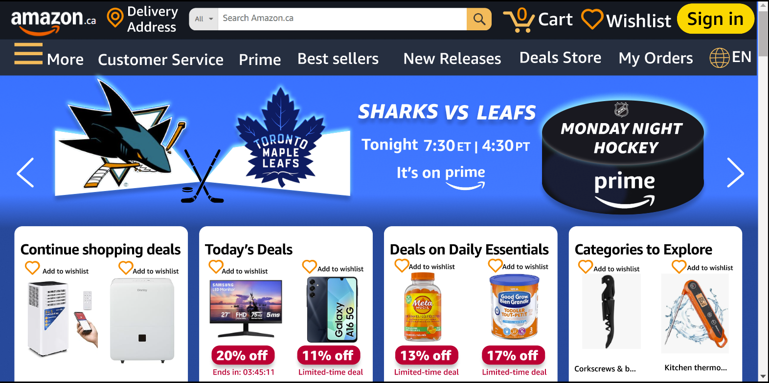
✅ Streamlined Navigation:
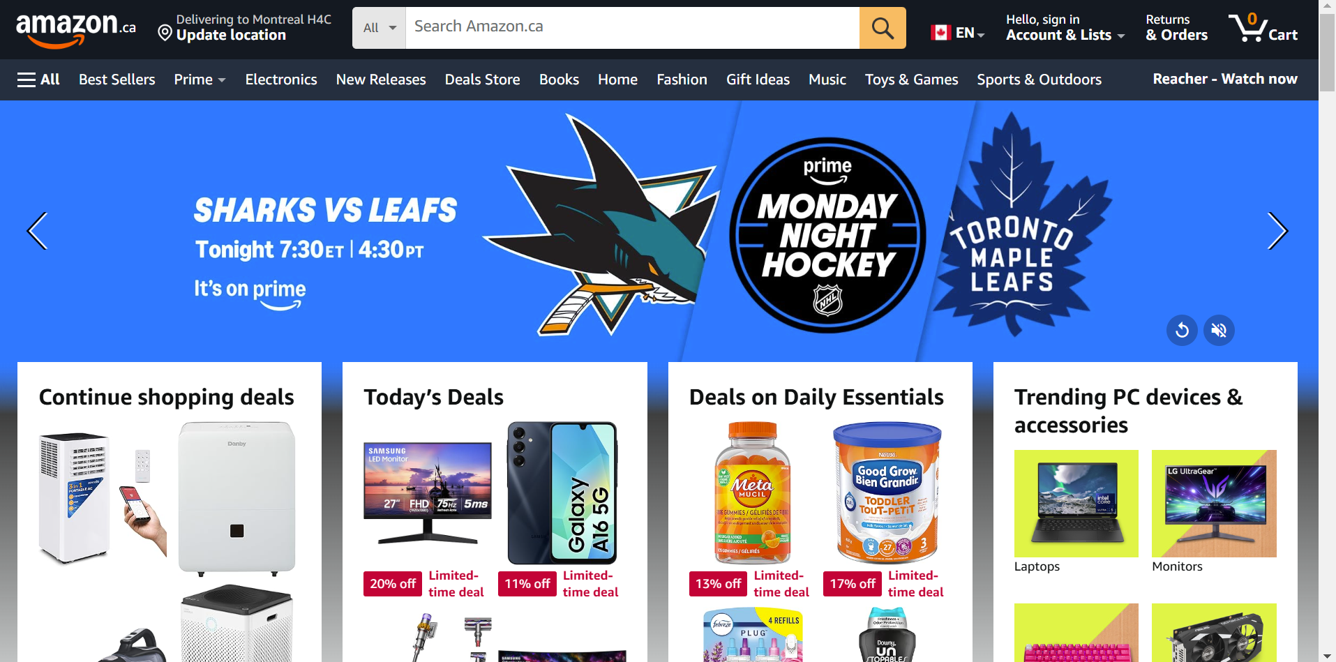
The menu uses clear, high-priority categories to reduce decision fatigue. Important sections like “Wishlist” and “Customer Service” are easy to find, so Emily can quickly access the features she uses most. A large yellow sign-in button is placed in a visible area. This makes the sign-in option easy to notice, especially for users with moderate visual impairments. Because the button stands out, users can find it quickly without effort. This reduces cognitive load and improves the overall experience.
✅ Larger Text & Enhanced Readability:
Increased font sizes and better spacing make it easier for Emily to read and navigate. By using a darker shade of blue for background the Improved contrast between text and background enhanced visibility, reducing eye strain.
✅ Improved Wishlist Functionality:
The “Wishlist” feature is now more accessible, with visible “Add to Wishlist” buttons directly on product listings. This makes it effortless for Emily to save and track items without digging through menus.(Acknowledgement: I recognize that the original design of Amazon’s homepage is not solely a result of poor UX but also a deliberate marketing strategy. Hiding or deprioritizing the wishlist feature serves a business purpose—it encourages impulse purchases rather than planned shopping. By making it harder to find saved items, users may be more inclined to buy immediately rather than wait. However, for users like Emily Clark, who actively rely on wishlists to organize future purchases, this approach leads to frustration rather than increased spending. Instead of encouraging more engagement, it creates friction that might push users away.)
✅ Balancing Business Goals with User Needs While my redesign makes the wishlist more accessible, it does not disrupt Amazon’s revenue model. Instead, it enhances user trust, self efficacy, and satisfaction, which in turn can foster long-term customer loyalty. If Emily finds Amazon easier to use, she is more likely to return, rely on it for shopping, and complete her purchases rather than abandoning shopping out of frustration. Thus, my redesign aligns both user needs and business goals, proving that accessibility and marketing strategies can coexist effectively. By implementing these changes, my design offers a more user-friendly, stress-free shopping experience for older adults like Emily, ensuring she can browse, plan, and purchase with ease.